Presenting Results
Displaying Numerical Summary of Results
Displaying the numerical summary of the results of an analysis and compairing multiple results is described on the Running a Job page.
Displaying Results in Geographic View
To display the results geographically select the Geographic Result Icon ![]() to left.
to left.
The results are presented by colouring the legs and ground segments. The colour scale is relative, meaning that the highest probability is given the colour red and the lowest is given the colour yellow. So the red colour does not necessarily imply the leg or ground segment is a high risk area.
Collisions are displayed as colours on the legs while Groundings are displayed as colours on segments of polygons.
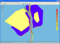
Fig. A - Colour Coded Geographic view of results.

Displaying Results on Tabular Form
The results can be presented as ship-ship collisions. Click on the icon ![]() in the Job View Window and a window similar to fig. B will appear.
in the Job View Window and a window similar to fig. B will appear.
Here the striking ships are shown horizontally and the struck ships are shown vertically.
It can for example be seen that the probability of Container ships striking crude oil tankers is 0.0047.
The results can be filtered by leg and collision type.
Remember the colours are relative and do not inform about the absolute severity. The colours identify the maximum values within the current display.

fig. B - Tabular view of Ship-Ship Collisions
